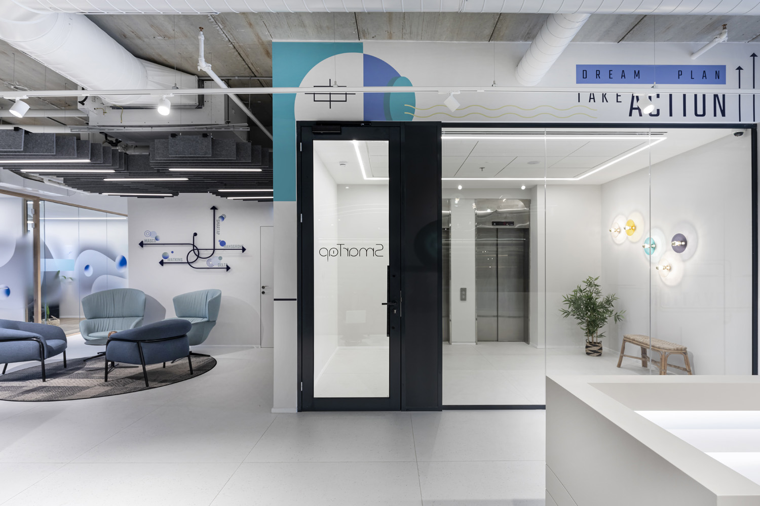
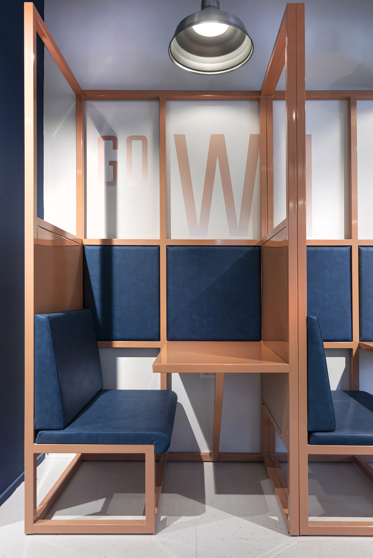
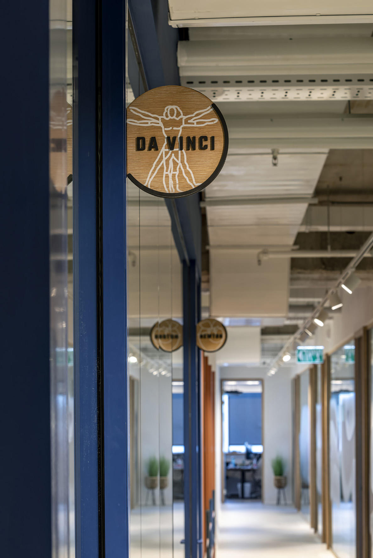
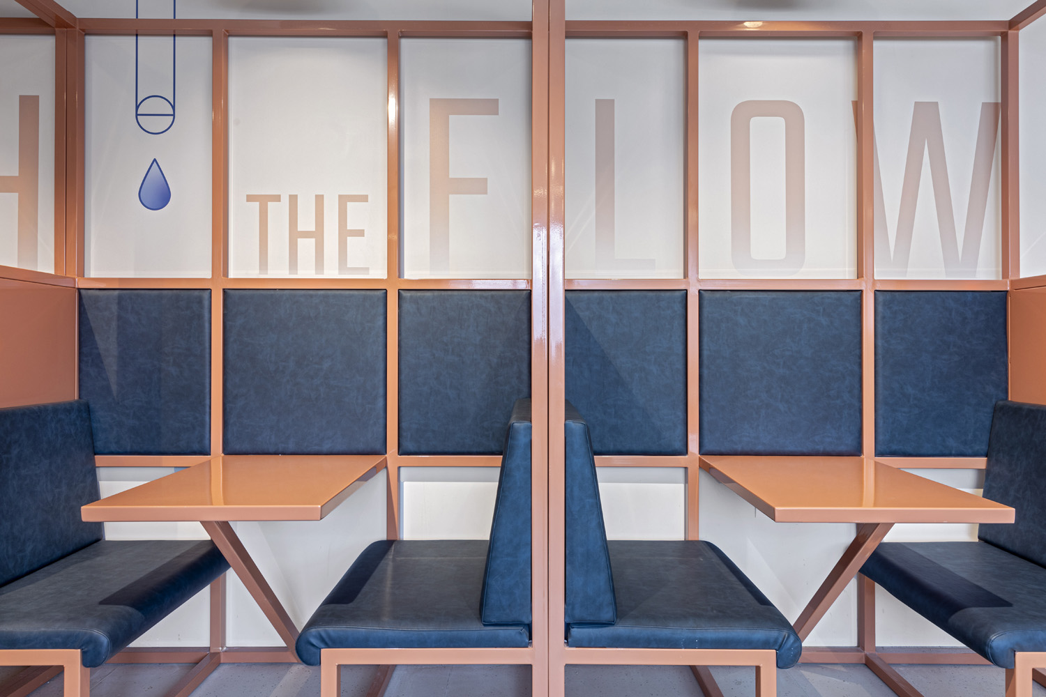
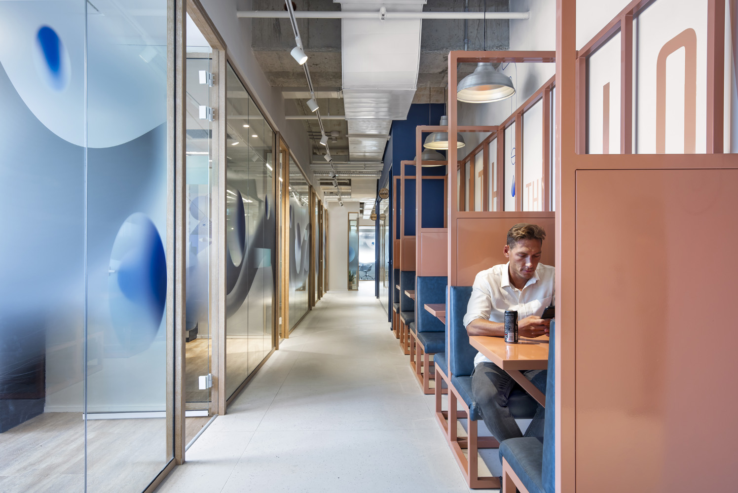
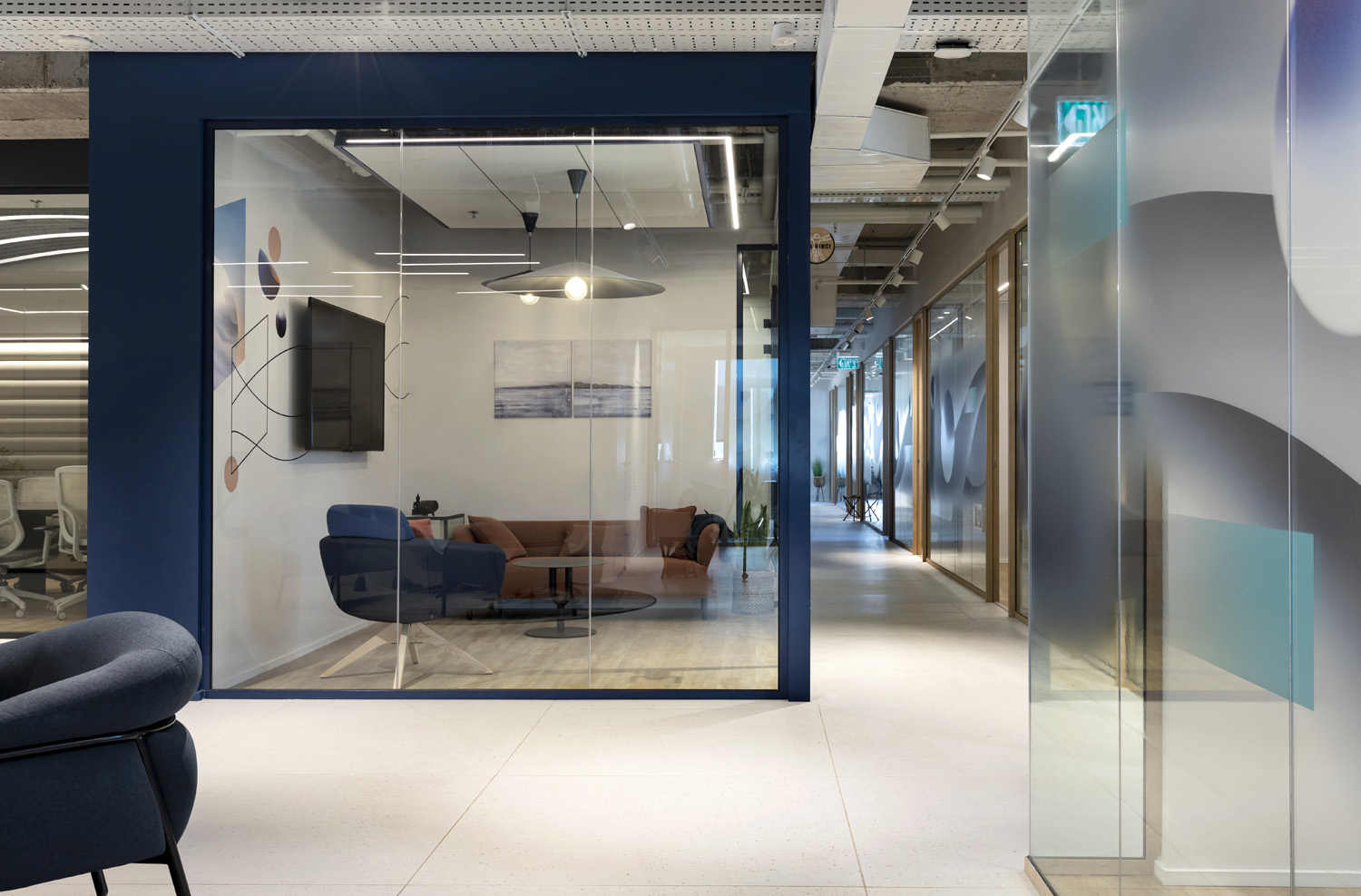
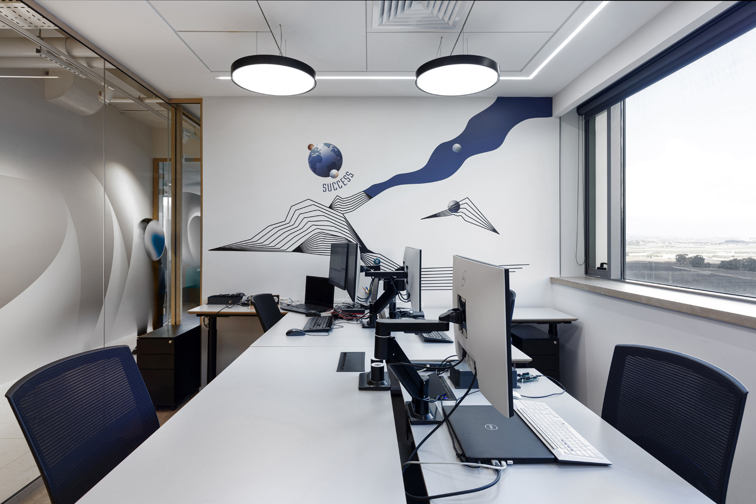
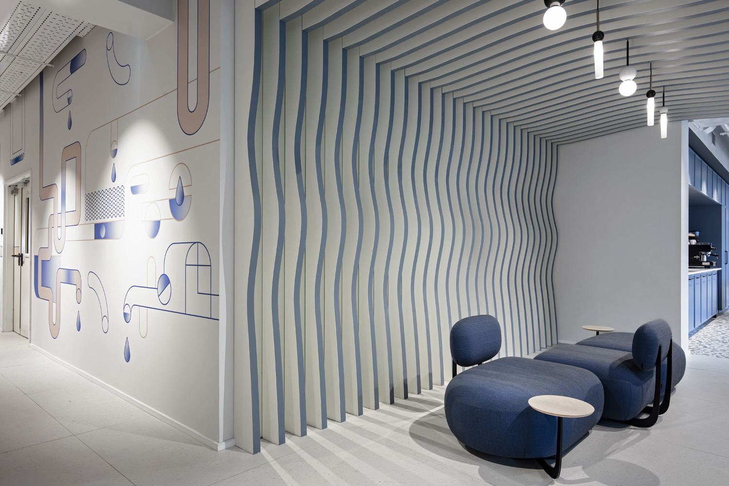
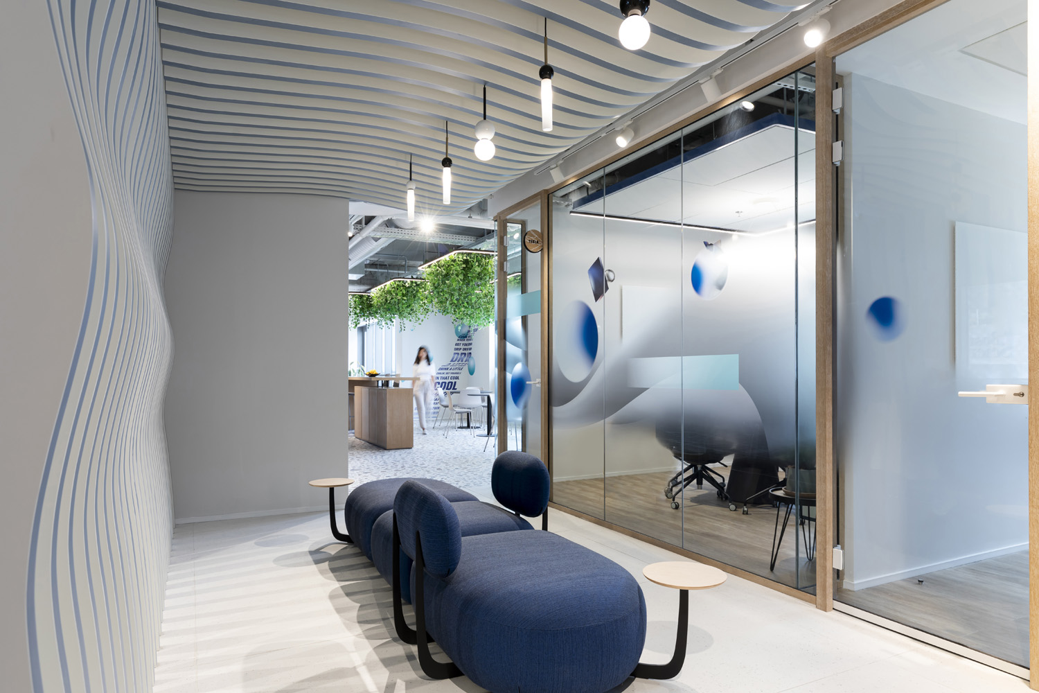
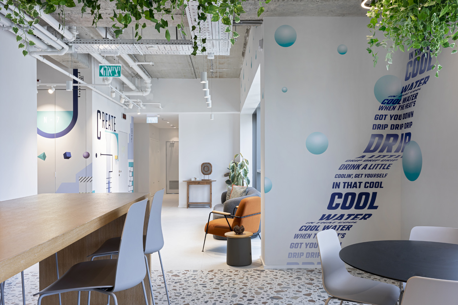
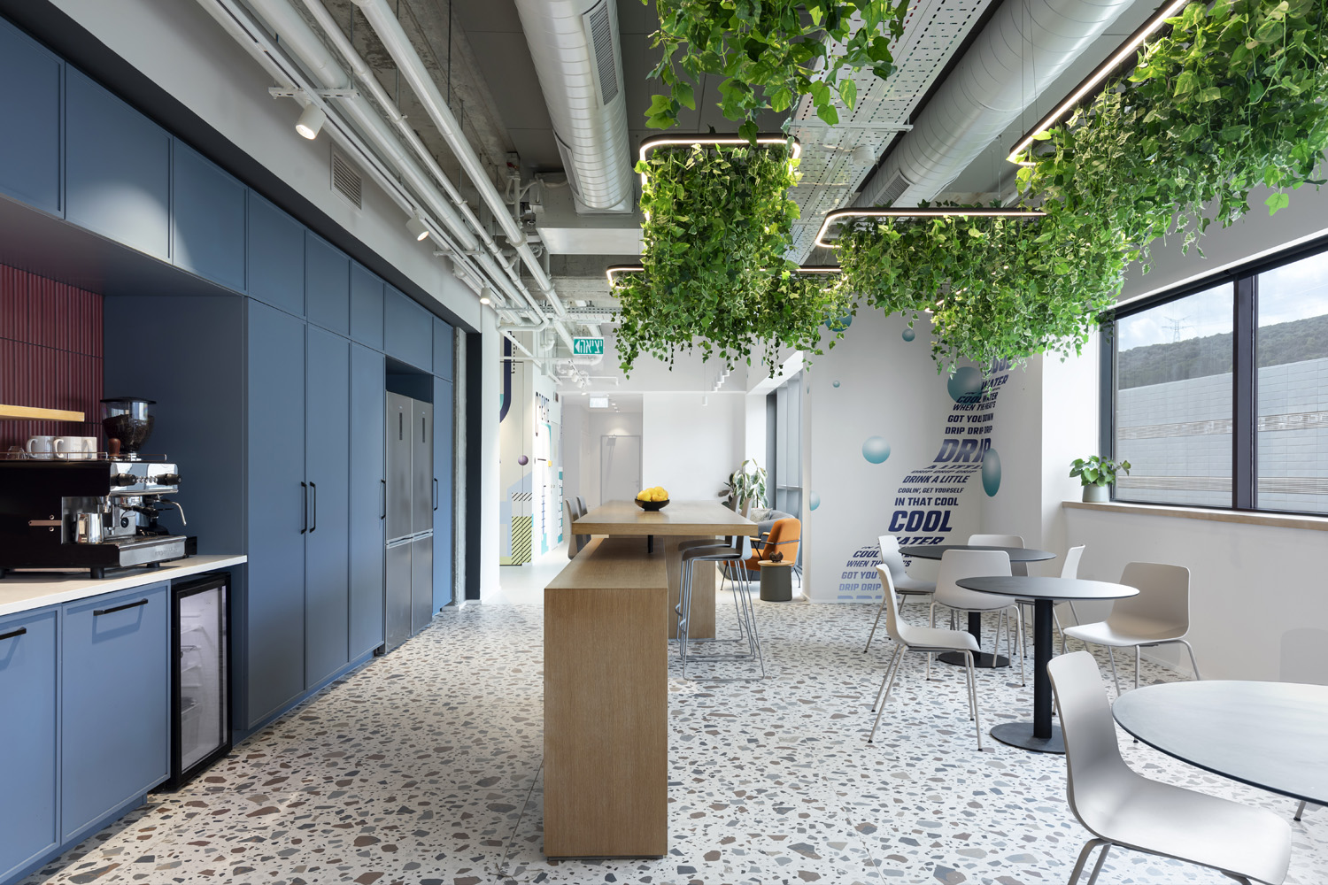
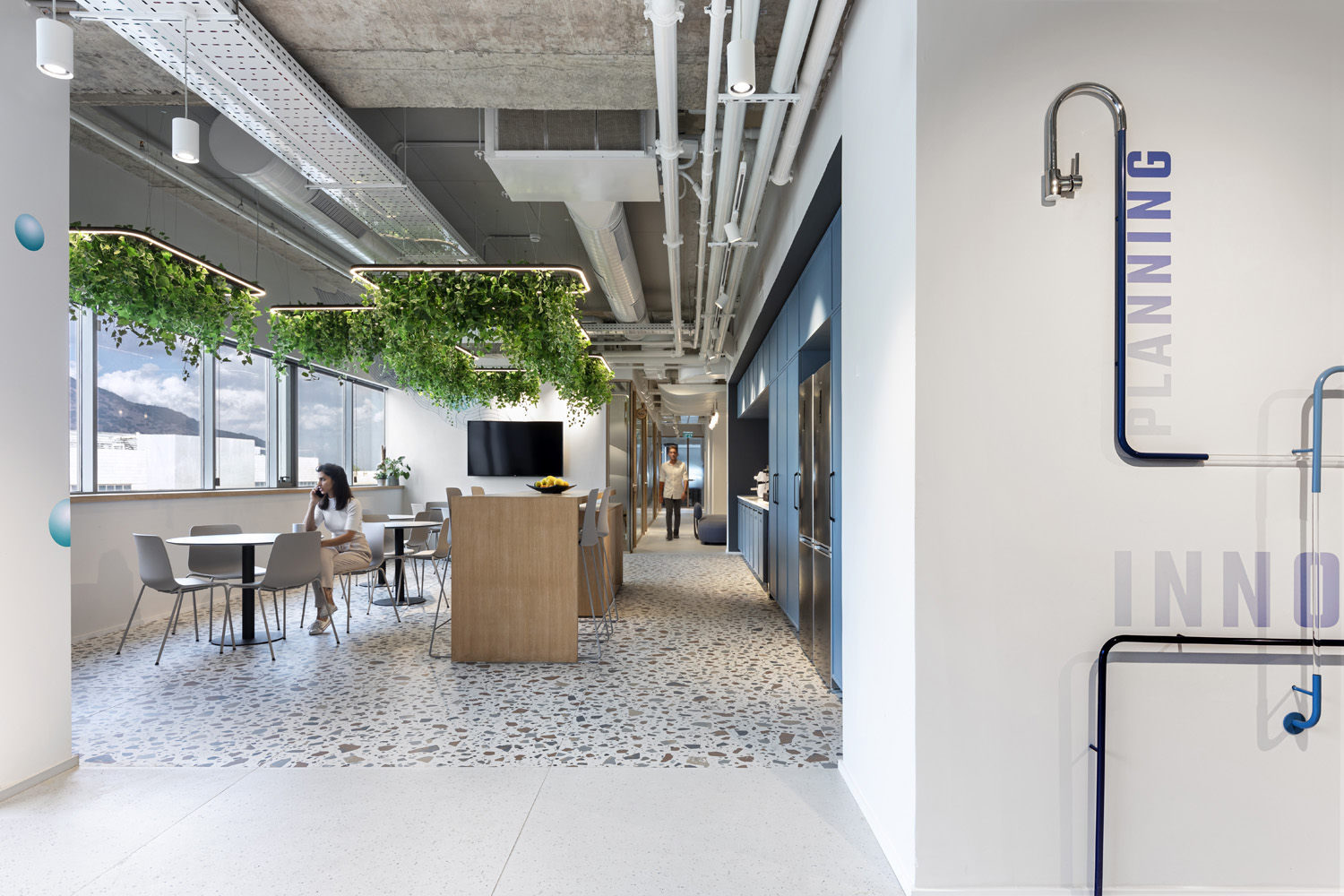
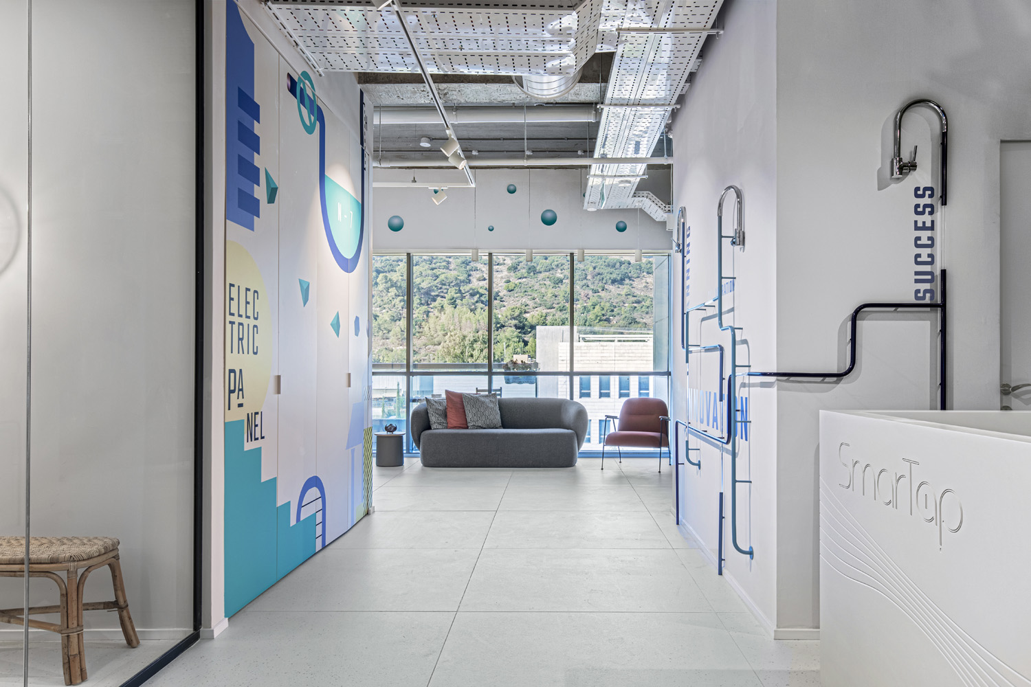
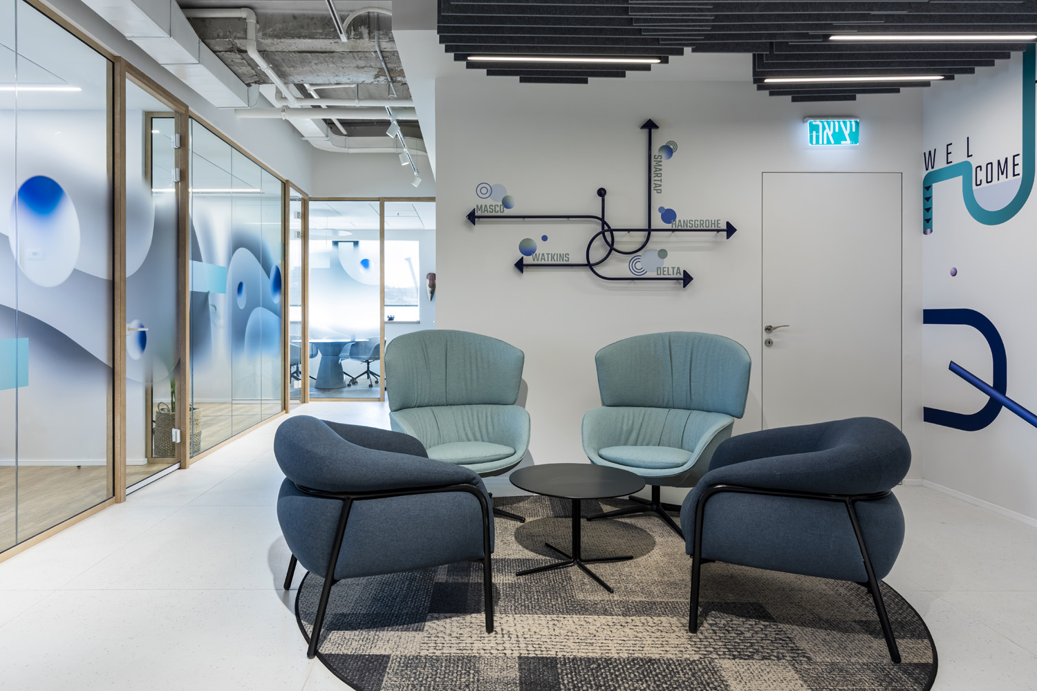
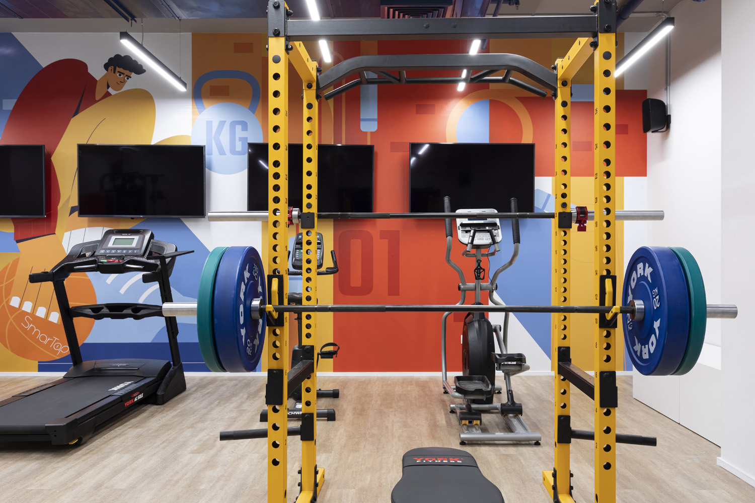
SmartTap is a company dedicated to water technology and the development of smart home water systems. Our goal was to design a branding language as impressive and unique as possible since it should function as the starting point for inspiration and creativity for the company’s employees. The main theme on which the visual language we created centers of course on – water! The color palette is mostly in blue-green shades and the entire form is affected by the movement of water flow. Our eyes are swept along by the fluid design on top of the glasses. The graphics in the booths in the corner of the cafe work in a homogenous manner with the architecture and the interior design. The inspiration wall consists of pipes and faucets that create a dynamic composition on the wall next to the entrance counter. The graphic designs along the corridors draw visual and conceptual inspiration from the water piping system.

