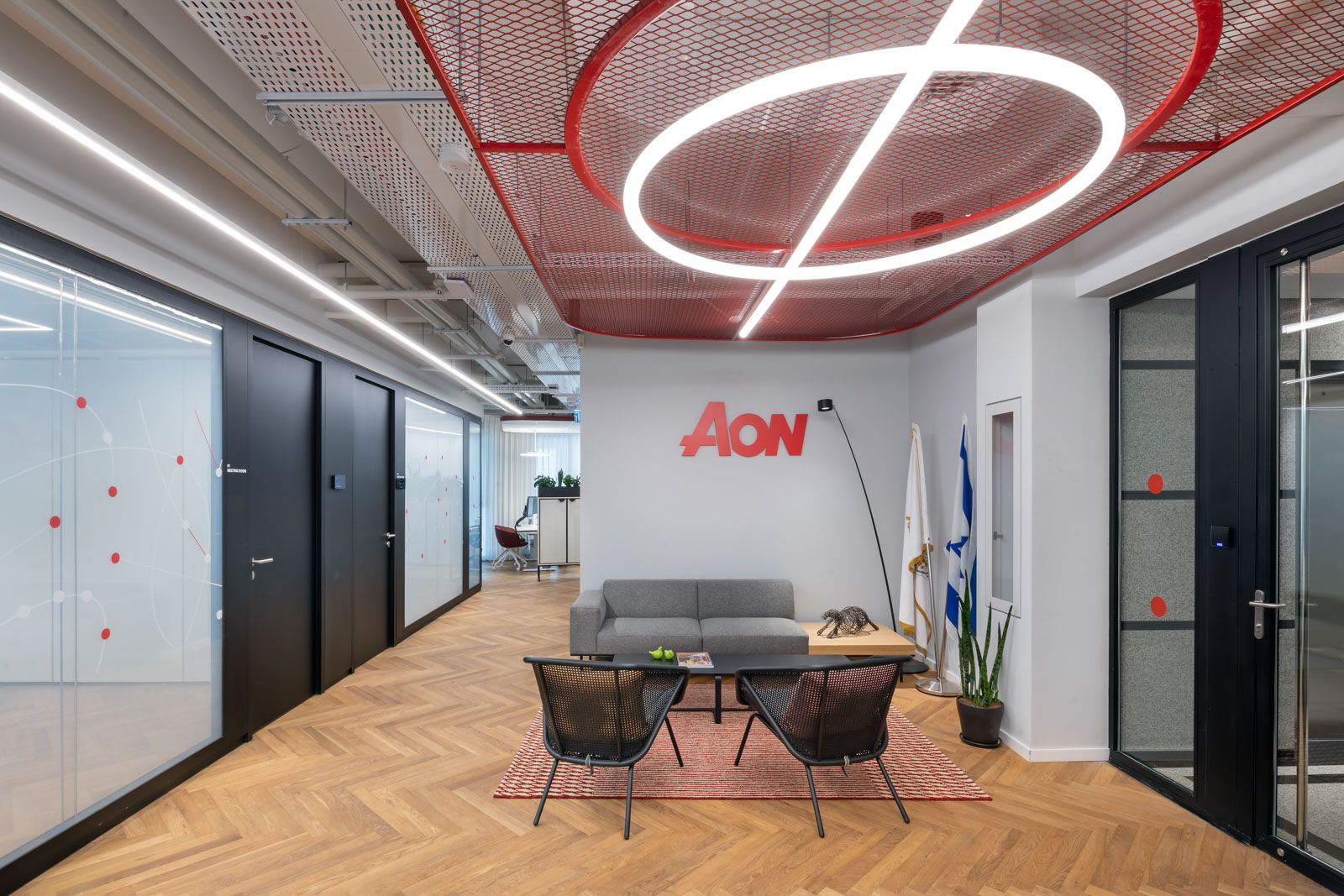
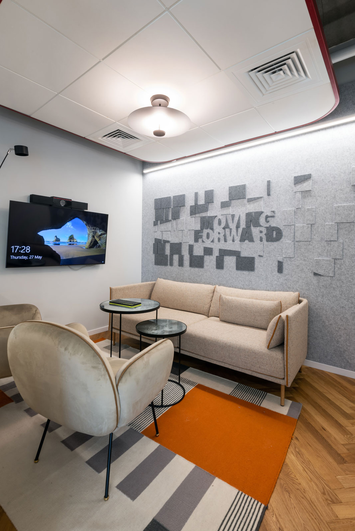
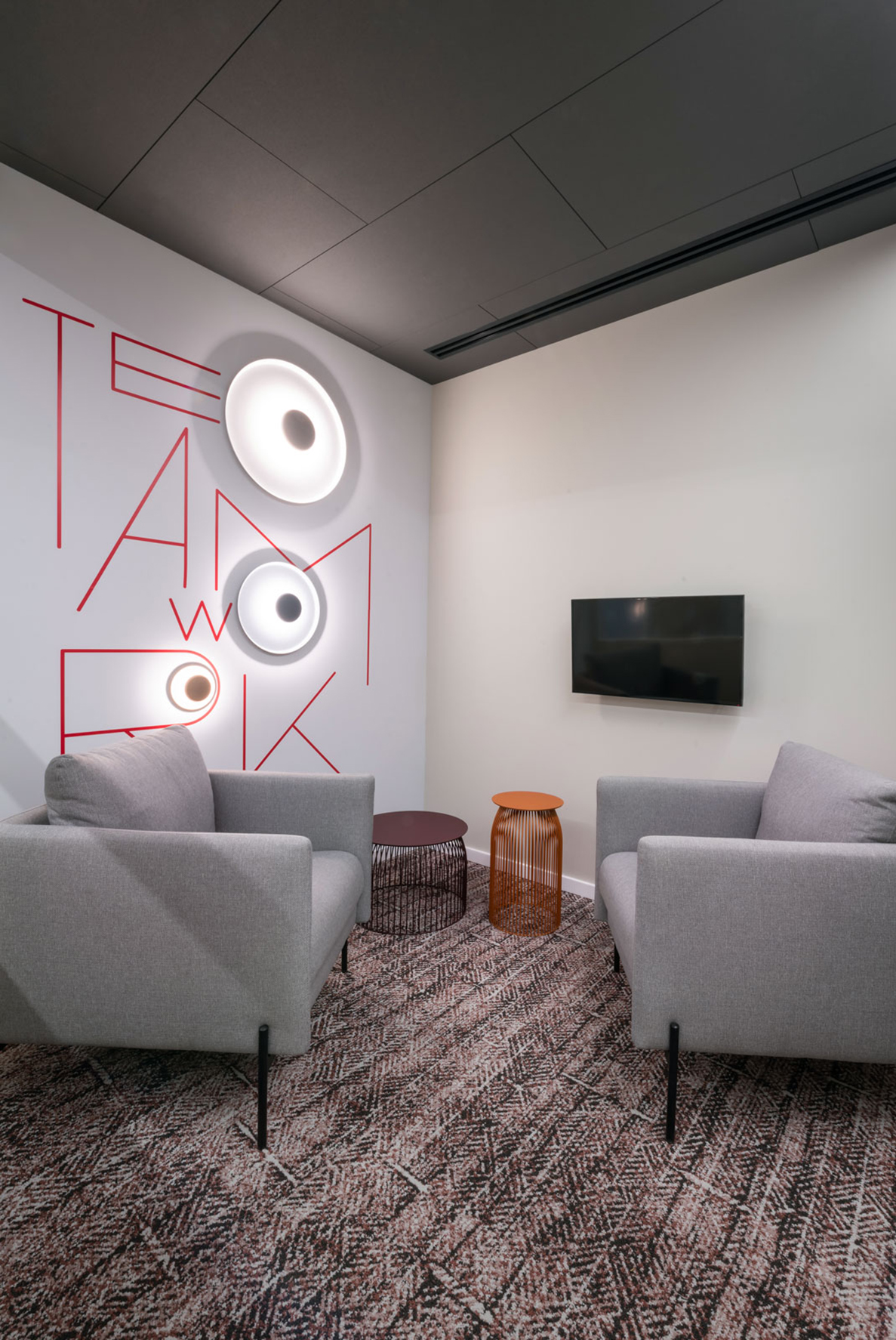
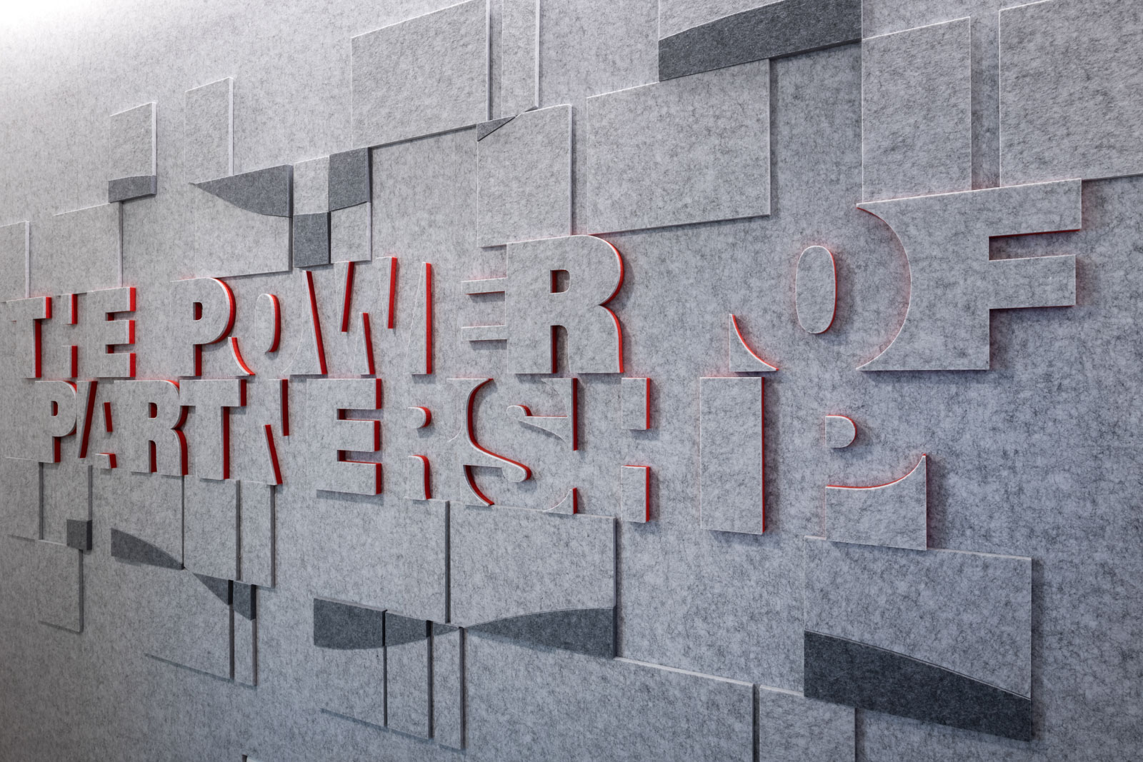
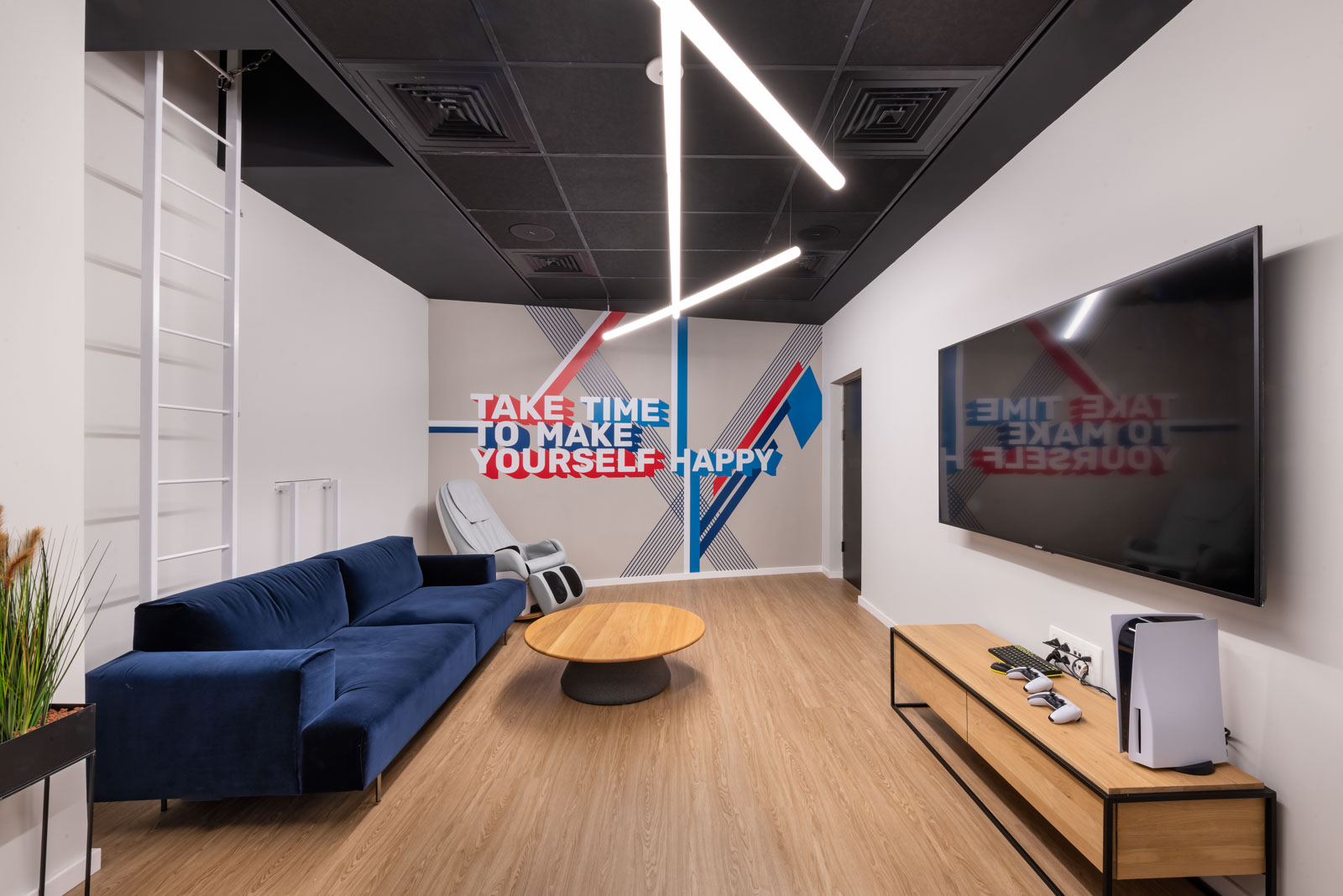
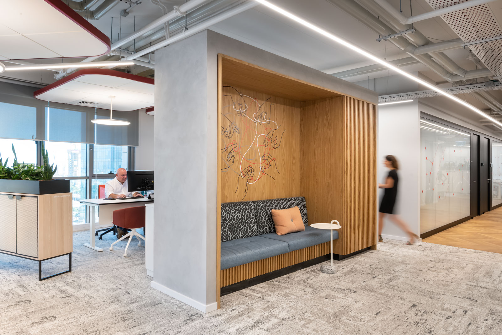
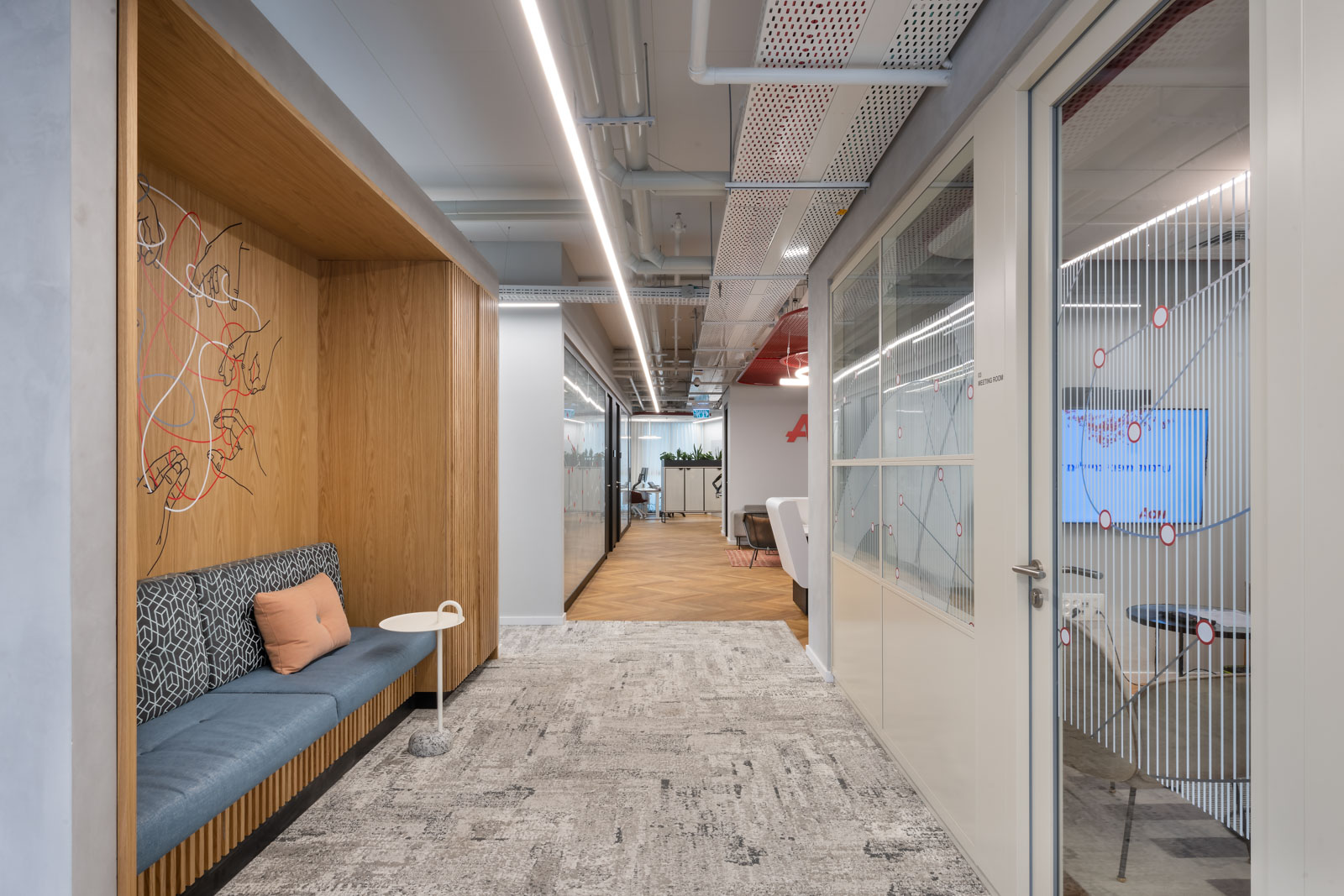
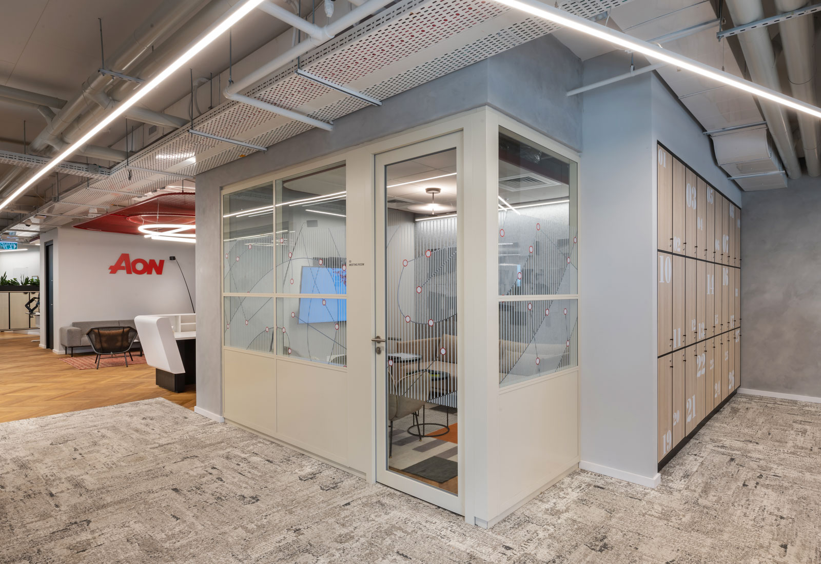
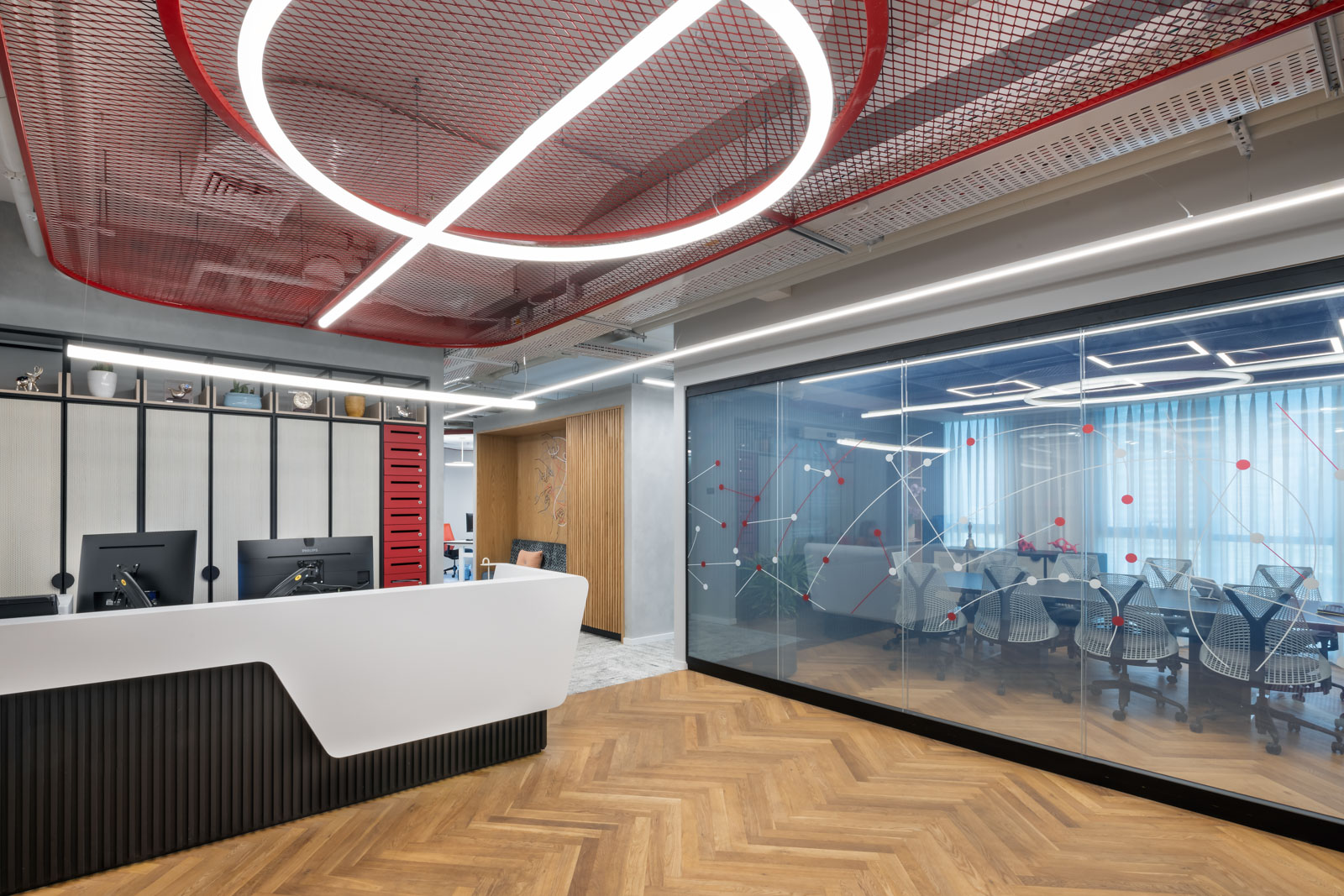
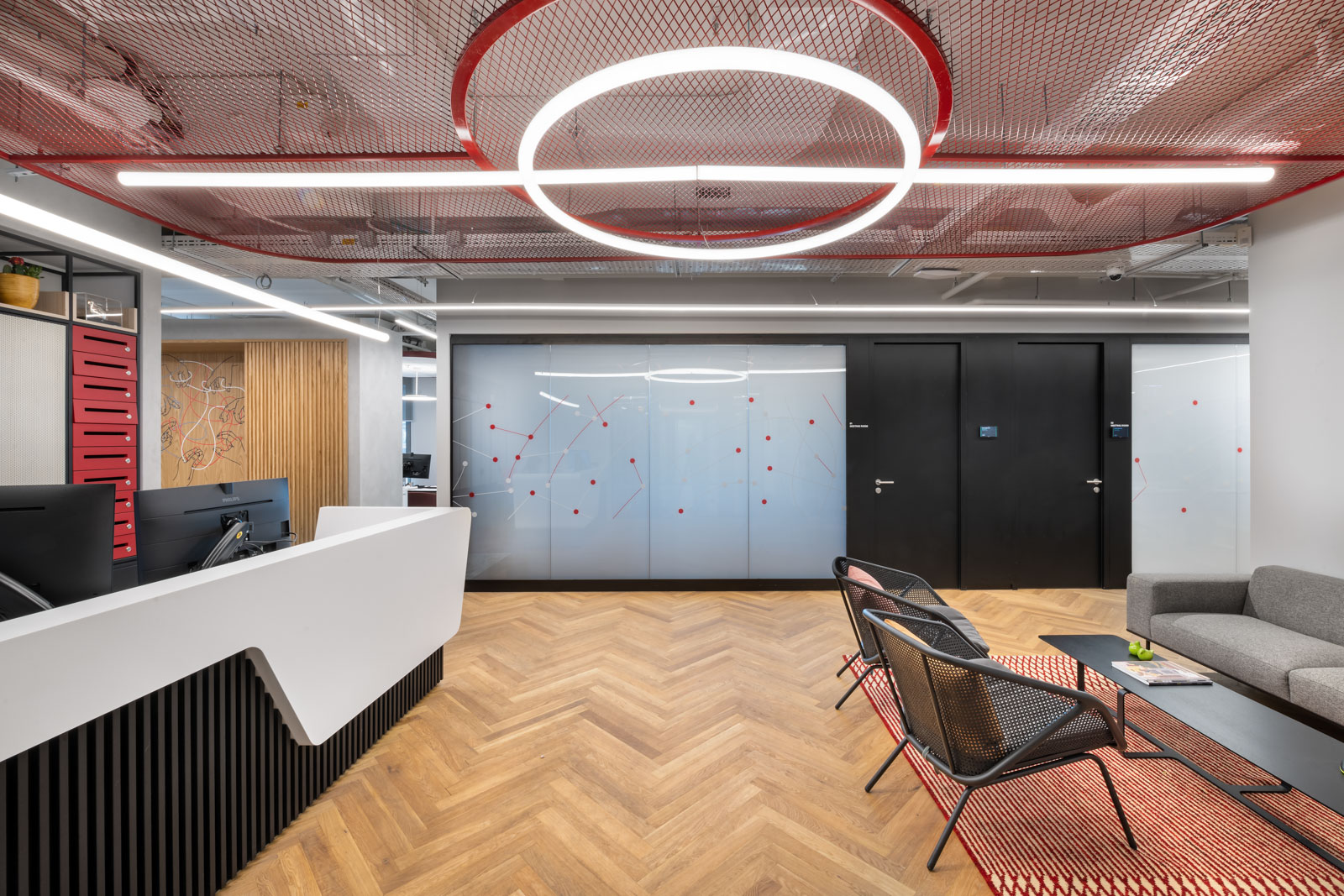
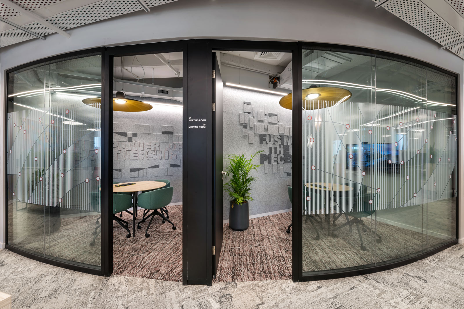
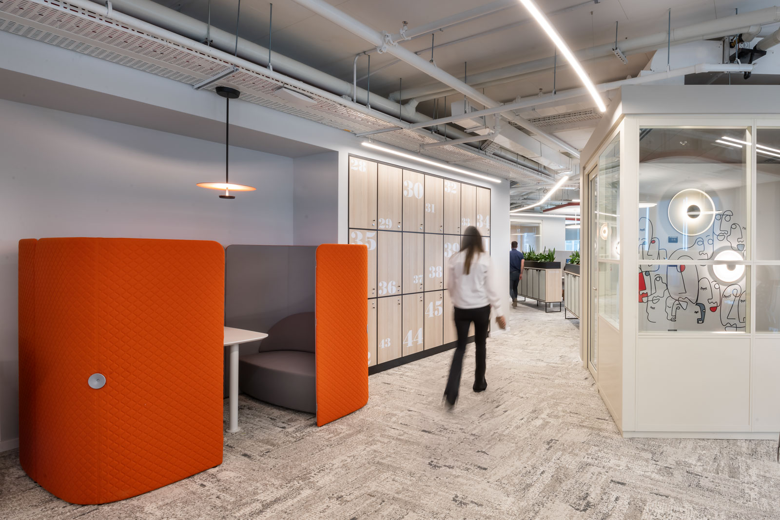
AON is the leading and largest independent international insurance agency in the field of general insurance and represents the leading insurance companies in the market. The company’s branding consists of striking colors, the strong red color also plays a central role in the space and creates a young and intriguing combination together with the light birch wood and the grayish tones from the architecture. The general language in the project is mostly geometric and comes from the formality of the letters A and N that appear in the logo. The acoustic walls accompanied by typography with a geometric font and squares of different sizes convey a sense of innovation, striving forward. The letter O is soft and amorphous, as you can see a looser and softer line in the glasses as well as subtle touches also in the walls of the Open Spaces.

